

Rewind Backups for Github
In my second term as Product Design Intern at a B2B startup called Rewind which protects critical data for SaaS applications, I had the opportunity to design a new interface for an acquired product called Backhub, the leading Backups-for-SaaS software for GitHub repositories. I collaborated with product managers and developers, working under the mentorship of the Senior Product Designer.
My challenge was to explore how we could improve the existing Backhub user experience and align the old UI to our design system while making the migration of these users to the Rewind platform as seamless and intuitive as possible.
MY ROLE
Product Designer
TIMELINE
May - June 2022
TOOLS USED
Figma, UserInterviews.com, Dovetail, Miro
RESEARCH
Understanding the users
Before making design decisions, I focused on deeply understanding Backhub’s users - who they are, what motivates them to log in, which features they rely on most, and where they encounter friction. I conducted user interviews, observed real-time interactions with the current UI, and set up a new dashboard in Dovetail to track feature usage data. From these insights, I developed user personas mapped to specific feature behaviours, creating a clear foundation for the design process moving forward.
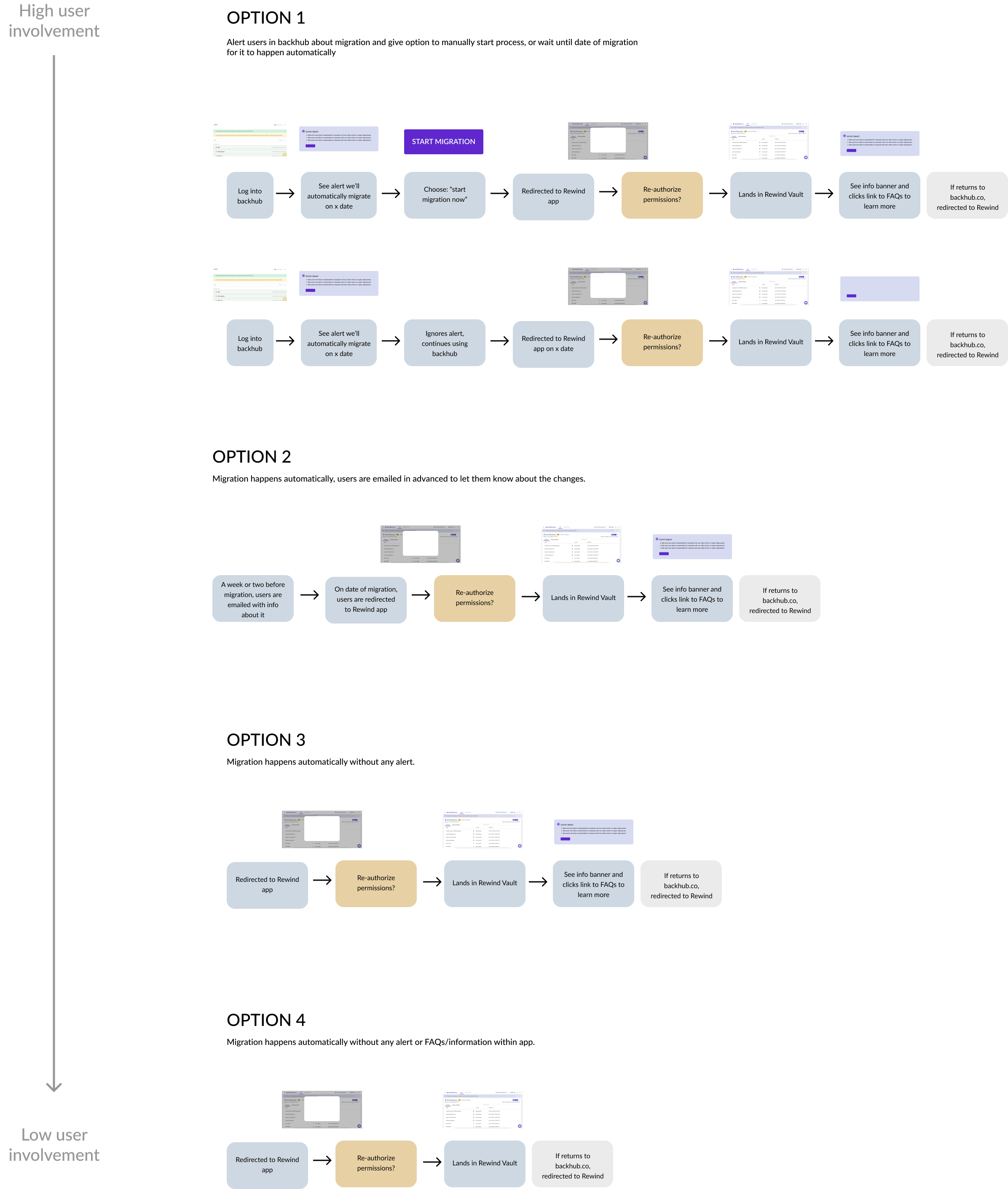
Mapping migration flows
The migration would bring major changes for Backhub users, affecting both interface interactions and product functionality. To ensure a seamless transition, I researched best practices for user migration, consulting UX studies and analyzing patterns from other companies integrating acquired products into their platforms. Based on these findings, I outlined and visualized multiple migration strategies, then worked with product and development teams to align on the most user-friendly path forward.
Considerations for future adaptation
From a product strategy perspective, the design needed to work within the current interface and design system while anticipating future platforms in the “development” vertical (e.g., Bitbucket, GitLab). I researched the types of data these platforms would require for backup and display, ensuring the GitHub-focused design could seamlessly adapt to similar products in the future.
DESIGN
Initial explorations
We began by exploring two main approaches:
1 - Recreate the existing Backhub experience using the Rewind design system. This would make the migration seamless for current Backhub users but would not resolve existing pain points. For example, backups were displayed in a spaced-out list format, with key details hidden in dropdowns. This structure required excessive clicking and scrolling to view all data, one of the primary usability challenges uncovered during research.

2 - Adopt Rewind’s existing “vault” UI for displaying backups across all apps. This approach would be the fastest to develop and ensure a consistent experience within the Rewind platform. However, the data visualization method used for smaller, item-level backups (e.g., a single Shopify product) wasn’t suitable for GitHub, where each backup, such as a code repository, contained significantly more complex and detailed information.

Arriving at a new solution
To address these challenges, I set out to create a design that improved visibility and streamlined key actions. I introduced a side panel that displays details for the selected repository, enables relevant actions, and allows quick navigation between items via new arrow controls. This approach significantly reduced the number of clicks required, making the workflow faster and more intuitive.

A significant reduction in scroll
See the difference below in the amount of scrolling & clicking required from the original app to the new solution.
The original Backhub app required lots of clicking and scrolling.
The new design uses a slide out and arrow navigation to solve this pain point.
ITERATION
Testing with an interactive prototype
To validate the solution, I conducted usability tests with six participants: five recruited through UserInterviews.com (pre-screened GitHub users with a need to back up repositories) and one current Backhub user.
The sessions began with questions about each participant’s role and existing backup processes. I then asked them to complete a series of tasks using a clickable prototype, followed by open-ended questions about their experience; what was clear, what was confusing, and what functionality they expected but didn’t find.
For note-taking, I used a collaborative, contextual approach: team members and I added sticky notes directly onto prototype screenshots in Miro, marking pain points, moments of friction, and opportunities for improvement.
Overall Findings
The usability tests validated the overall design: 100% of participants successfully completed all tasks, and all described the experience as simple and intuitive.
The sessions also revealed opportunities for improvement. Nearly all participants struggled to locate the Audit Log, leading us to move it to the main menu for greater visibility. We also found that the icons distinguishing private from public repositories were unclear, so we replaced them with text labels for clarity.
Final Designs
Click to view larger screens.
Reflection
This project was a valuable design challenge that deepened my skills in balancing user needs with business and technical constraints. I had to design for users’ expectations while respecting the experience they were accustomed to and the constraints of the existing design system. This required extensive research and empathy - considering not only their interaction flow within the product, but also their migration journey from the current platform to the new one. I gained significant experience in user interviews, cross-functional collaboration, and iterative testing. Presenting my findings to the team reinforced the value of storytelling as a powerful way to communicate the design process and the rationale behind key decisions.